What is this?
The Musical Wayfinder is an interactive visualization intended to bridge that gap between us and our music. This tool allows you to track your musical tastes through time, investigate the musical attributes of > 3,000 genres catalogued by Spotify, and discover where your personal library falls within that vast musical landscape.
You can find more information about the Wayfinder by reading this paper and poster, produced as deliverables for the CSE 512 Data Visualization course at the University of Washington.
How do I use it?
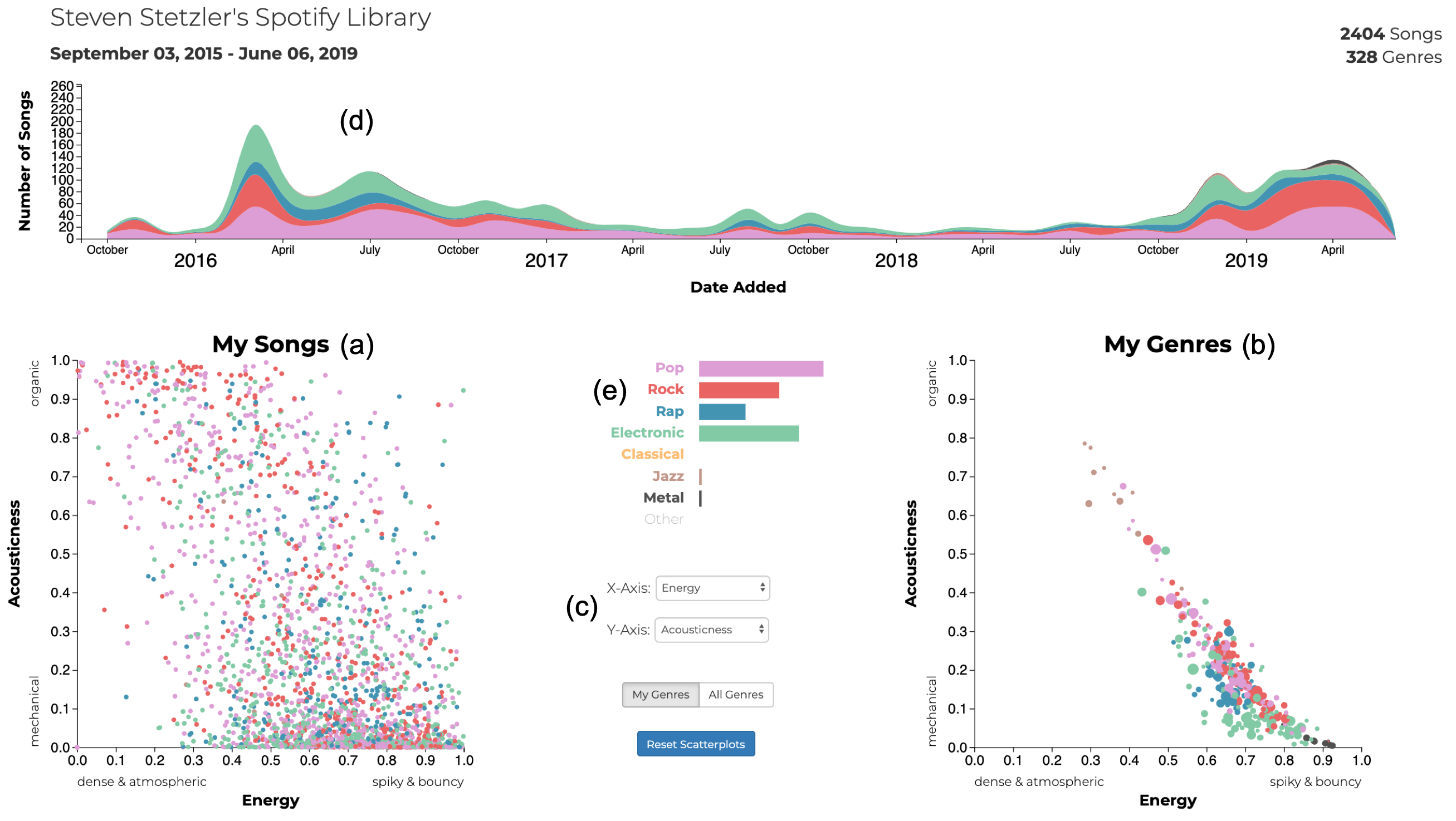
This is the Musical Wayfinder dashboard. The two scatter plots show your library songs (a) and the genres that your library is composed of (b). Dropdown menus (c) allow you to select the axes of the scatter plots, which represent Spotify audio features. A timeline (d) shows when you added songs to your library. A legend (e) shows the colors corresponding to the umbrella genres that each song and genre are classified into. Bars show the relative abundances of those umbrella genres in the your library. A brush filter can be used to select a time range in the timeline. This interaction updates the songs and genres shown in the scatter plots as well as the size of the bars in the legend to reflect your library composition over the selected time range.
Interactions
Scatter Plots
Hover over a point on either scatter plot to see information about an individual song or genre.
Select which axes to plot by clicking on the "X-Axis" and "Y-Axis" dropdown menus and selecting an option.
Click on a point to embed a Spotify player with a preview of a song or genre.
Control+Click / Command+Click on a point to select/deselect it. Performing this action on a song will show you when you added it to your library in the timeline and all of the genres it belongs to in the genre plot. Performing this action on a genre will show you when you added songs from that genre in the timeline and all of the songs that belong to it.
Timeline
Click and drag over a region in the timeline to have the visualization reflect your library in a certain time range.
Click and drag on the ends of a time selection to resize your selection.
Legend
Hover over an umbrella genre to highlight it in the timeline.
Click on an umbrella genre to remove / add it back into the data under consideration.
My Genres / All Genres
Click on either the "My Genres" or the "All Genres" button to toggle displaying either just the genres in your library / your current selection, or displaying all of the genres that Spotify catalogues.
Top Tracks / Artists
Click on a track or artist in the lists to select/deselect to make a selection on them. If a track or artist does not appear, it may not be in your saved tracks on Spotify.
Lost?
Click on the reset button to reset all plots to their default view.
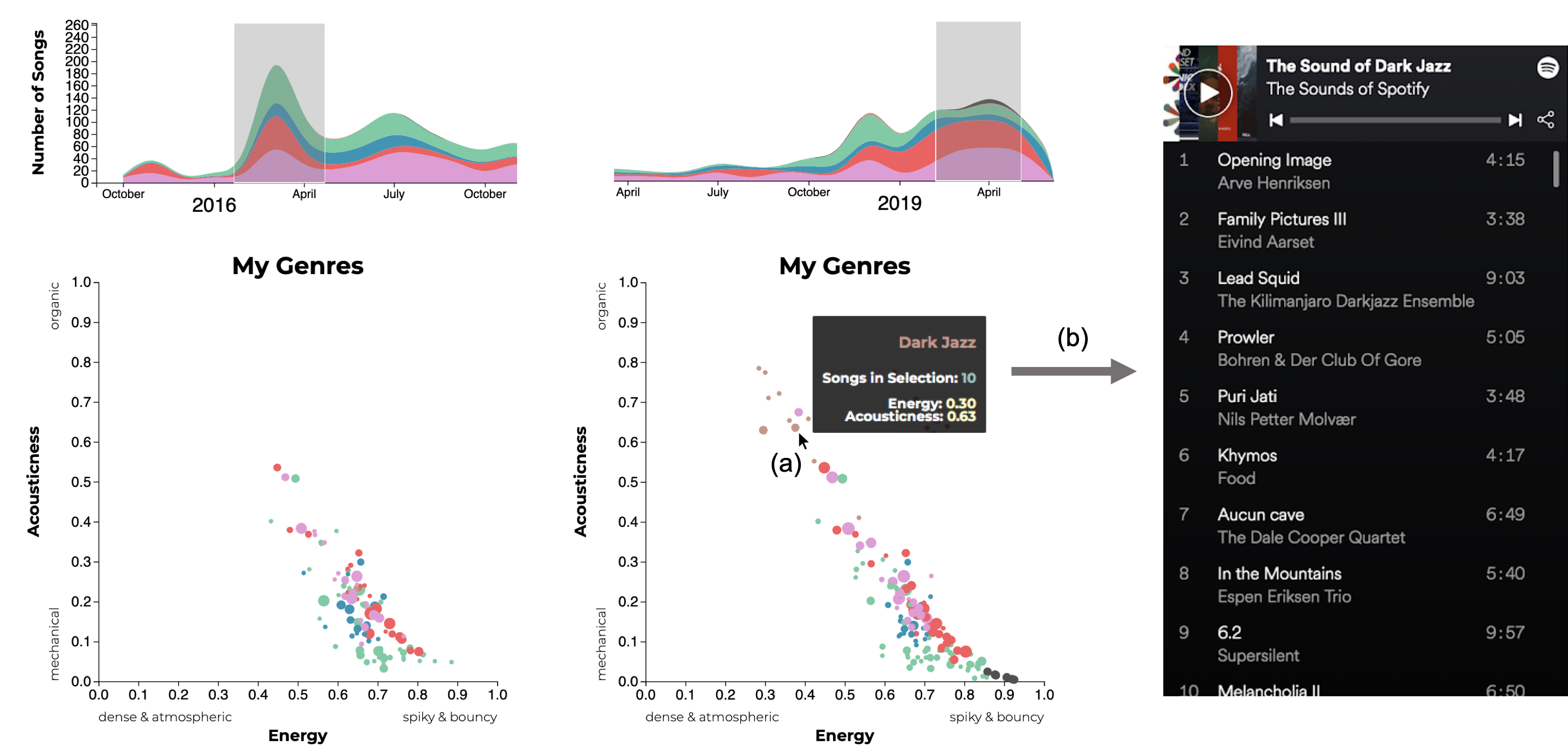
Example interaction
By brushing on the timeline, you can gain insight into how your library has evolved over time. In the example below, selecting a region early in time reveals the genres that the user was initially exposed to (left). Selecting a more recent region at the end of the timeline reveals that the genres the user is adding to their library have become more varied (middle). You can discover what new genres you have added by hovering over them (a). A tooltip shows the name of the genre, its average song attribute values, and the number of songs of that genre in the current time selection. Clicking on the genre (b) produces a playlist created by Spotify that represents that genre (right).